
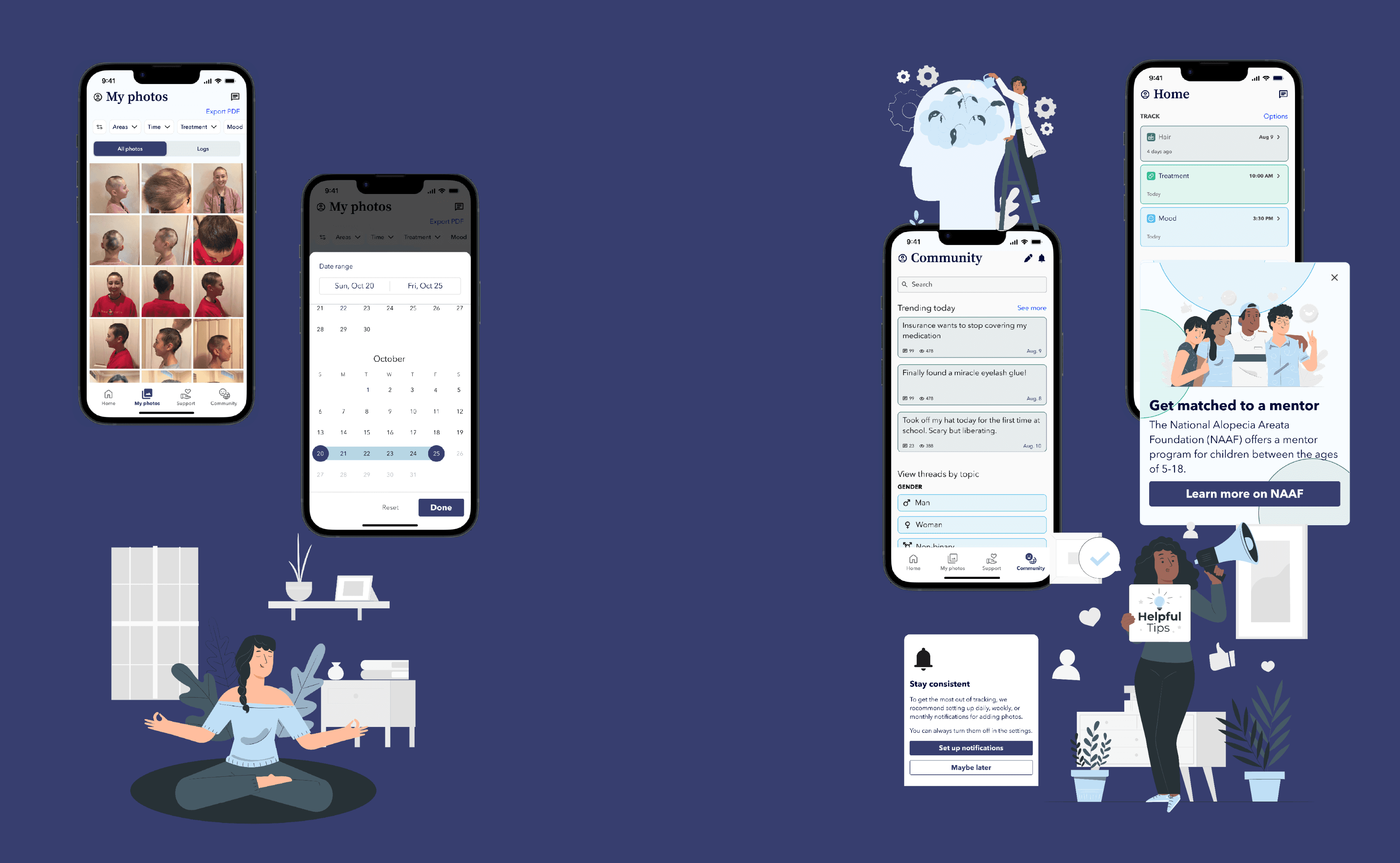
end-to-end app: bloom
Designing a medical hair and mood tracking app for people with alopecia areata to bolster collaboration with physicians via image organization.
Skills: UX research, UX design, brand design

overview
BACKGROUND
Photo documentation struggles
Alopecia areata is an autoimmune condition associated with hair loss ranging from patches to total baldness. The National Alopecia Areata Foundation describes the condition as “surprisingly common,” affecting about 2% of the global population.
Some people with alopecia areata struggle with organizing hair images, relying on printed photos in clinics, complicating medical care. With this struggle in mind, I considered the following HMW question:
How might we help people with alopecia areata organize and transfer medical images to improve continuity of care?
SOLUTION
Bloom, a mobile app that helps people navigate alopecia through:
Symptoms, growth, and media logs to document progression, complete with downloadable reports to facilitate collaboration with physicians

Filters in photo history to ensure quick access to specific areas, timeframes, treatments, and moods
Mentorship and mood tracking to promote community and holistic care

discovery
User Interviews
Affinity Mapping
Persona
USER INTERVIEWS
Interviewing people with alopecia areata
8 individuals residing in the United States, ages 19-29
Interview length: 45 minutes
In these conversations, I explored the following questions:
How and why do people with alopecia document their hair growth journeys?
How do people grapple with the emotional difficulties of hair loss?
Apart from going to the doctor, how do people experiencing hair loss learn about different treatment options?

INTERVIEW TRENDS
Emotions, community, tracking, and medicine
Interviews helped me realize the emotional dimension of alopecia areata is just as, if not more, important than the medical aspect of the condition.
I found these four broader themes emerge:
Emotions and community
Interviewees often reported feeling “alone” or even “alien” at some point in their journeys.
Some reported feeling deep anguish and grief, sometimes seeking therapy to grapple with their diagnosis.
Tracking and MD collaboration
Some individual reported difficulty with respect to keeping images organized or having solely printed photographs in a medical office.
Difficulty surrounding consolidation of hair images complicated care at times.
Mentorship
Everyone who had signed up to become mentors reported finding guiding others through the wide range of emotions associated with alopecia to be incredibly meaningful.
However, many noted being somewhat inactive in this role.
Unawareness of resources
Many found solace in the National Alopecia Areata Foundation (NAAF), which offers a youth mentorship program, support groups, one-on-one phone support, and more.
However, one person I interviewed had not heard of the foundation, signalling how some are missing out on its resources.
PERSONA
Defining the users & exploring possibilities to help them navigate their condition
The alopecia areata community is diverse, and it is difficult to distill this wide breadth of experiences into a single persona. My persona seeks to describe the specific subpopulation of people with alopecia: those who track their hair, seek medical treatment to grow their hair, and would like to connect with others.
Why track hair?
excitement due to growth spurt
monitor loss
evaluate whether treatment is working:
how quickly?
how much hair is growing, and where?
Needs
sense of community -- not feeling like they are “on their own” in their struggles
gain access to info. to weigh pros and cons of treatment
stay up-to-date with new treatments through news, social media, etc.
Difficulties
needing to repeat medical history to new physicians
navigating insurance for medications & wigs
impact on mental health of losing hair
finding resources and emotional support for people with alopecia
With a wide range of identities in mind, I considered solutions that would address the following questions:
How might we connect people with alopecia areata with those who are able to empathize with them, guide them through the grief of losing one’s hair, and ultimately help them achieve a state of confidence and equanimity?
How might we help people with alopecia areata organize and transfer medical images to improve continuity of care?
designing the solution
User flows
Sketches
Wireframes


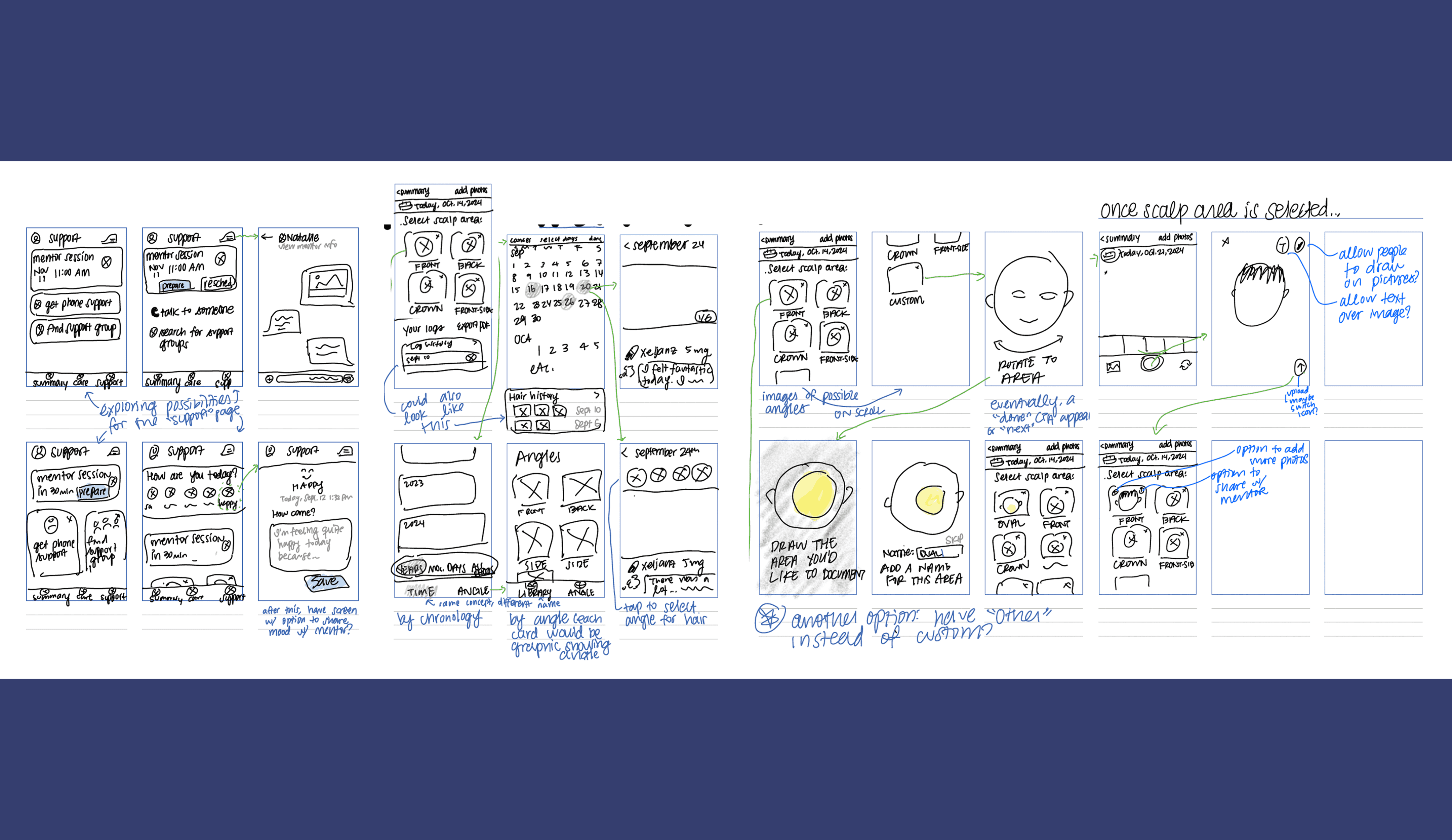
Lo-fi Wireframes
Rough, rapid-fire lo-fi mockups: mood tracking, photo organization, and custom areas


usability testing
round 1
MODERATED USABILITY TESTING
Lo-fi testing to identify user needs and explore concepts
Test length: 45 minutes
Remote moderated test
In this first round of usability testing, explored the following questions:
How clear is the app’s purpose and functionality to first-time users?
How easily can users navigate and complete core tasks, such as documenting their mood and viewing historical scalp photos?
Are there any dimensions of the alopecia experience that I have not addressed in these mid-fi designs?
If so, how can I align my designs with their needs to best help people navigate their condition?

USABILITY TESTING RESULTS
Iterations: round 1
Main insights from testing:
With the initial hair tracking concept, users felt limited as far as what they could track. Following this feedback, I added the option to track both hair loss symptoms and growth traits, in addition to photos themselves.
As far as photo roll navigation, the initial iOS-inspired camera-roll concept proved to be the wrong direction, as users worried it could be difficult to search for specific photos. Following this feedback, I added filters on the photo album section, allowing people to filter for multiple tags, ranging from area of scalp, time, and phase.
Enhanced customization and categories
Before

After

Video upload for more in-depth tracking
Phase, symptoms, and growth tracking for a wider range of tracking input
Enhanced camera roll experience
Before
Design inspired by iOS camera roll
Users expressed concerns that photo collections could become crowded and difficult to navigate


After

Added filters for quick sorts, enhancing patient-provider collaboration

Segmented controls for log-by-log view
Enhanced photo sorting experience
Before

After


Option to select multiple filter tags for enhanced specificity, whether to reflect for personal reasons or collaborating with physicians
usability testing
round 2
MODERATED USABILITY TESTING
Testing mood input, photo history viewings, and custom-area creation
Test length: 45 minutes
Remote moderated test
In this second round of usability testing, explored the following questions:
How clear is the app’s signifiers and use of icons for to first-time users?
How easily can users navigate and photo histories? How easily can they access this history, and what filters would they like to apply?
How is the mood logging experience: how can I align my mood logging experience with their needs to best help people navigate their condition?

USABILITY TESTING RESULTS
Iterations: round 2
The main changes revolved around the following:
Tracking
better signifiers and easier access to photo history
more text labels and more flexibility through video recording
Symptom input
more clarity in feedback via larger CTA
Photo history
enhanced filters and added export PDF button
Mood log
swapped icons for pills and addedof text field for a cleaner, richer
Community thread
additional subtitle for enhanced access to specific topics
Tracking: better signifiers, easier access to photo history, and better navigation icons
Navigation bar:
more clear with an icon change and text labels
My photos
Icon change
Because several users found it difficult to locate the their photo history, I added text labels to all icons, reducing cognitive load and improving accessibility.
Before

After

Tracking: more text labels and more flexibility through video recording
Before

After

Symptom input: more clarity in feedback via larger CTA
Before

After

Photo history: enhanced filter options and addition of "export PDF" button
Before

After

Photo history: enhanced time filters
Before

After


Mood log: swapped icons for pills and addedof text field for a cleaner look and richer input abilities
Before

After

Community thread: additional subtitle for enhanced access to specific topics
Before

After

design
Branding
UI Kit
Hi-fi Mockups
BRANDING
Promoting comfort, empowerment, and vibrance via imagery
Since my app serves people to promote holistic care, I tried to steer clear of imagery that felt sterile. I wanted my app to feel warm, calming, and trustworthy for people experiencing the uncertainty of alopecia.
Through imagery and the color palette, I strived to make Bloom welcoming of people of various backgrounds, of all emotions, and of all experiences.


Bloom UI Kit

select accessibility considerations
Consistent hierarchy and layout to reduce cognitive load.
Color contrast for all text and UI elements compliant with WCAG 2.1 AA.
Text labels for icons so users are not relying solely on icons
end result


next steps
If I were to extend this project, my next steps would be the following:
Interviewing medical professionals who have worked with people with alopecia areata to understand how to best support patient-provider collaboration.
Refining treatment tracking based on these conversations.
Conducting another round of usability testing on the treatment tracking feature.
reflection
First of all, I would like to extend my gratitude for all of the people I interviewed who so graciously and vulnerably shared their stories with me. This project wouldn't be possible without your interviews, and for that I am very grateful. Though I have a sister with alopecia, it wasn't until I spoke with you all that I truly started to understand the depth of struggle that alopecia so often comes with. I will do everything I can to turn my project into a live app in the hopes that it can help some of you.